The wine label is the heart and soul of any winery, making it one of the most challenging aspects when it comes to redesigning. In this blog post, we'll explore what you need to consider and what truly matters when it comes to creating the perfect wine label design.
Winelabel Design
A GUIDE FOR YOUR LABEL
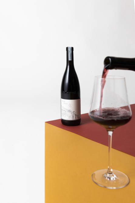
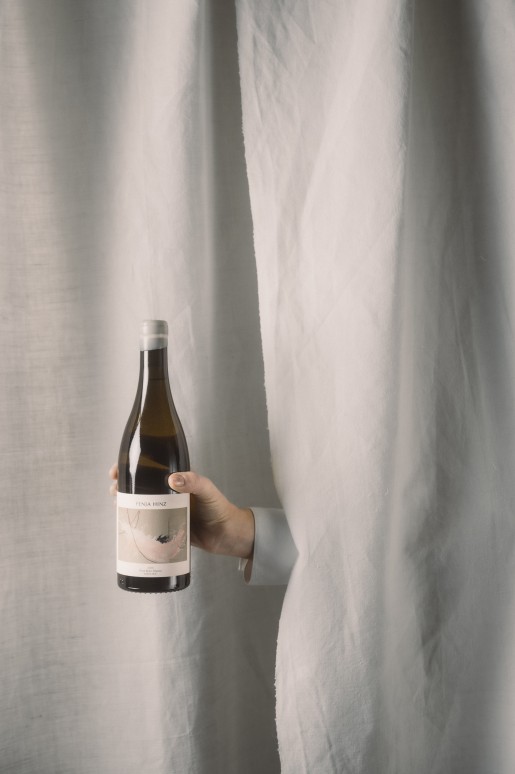
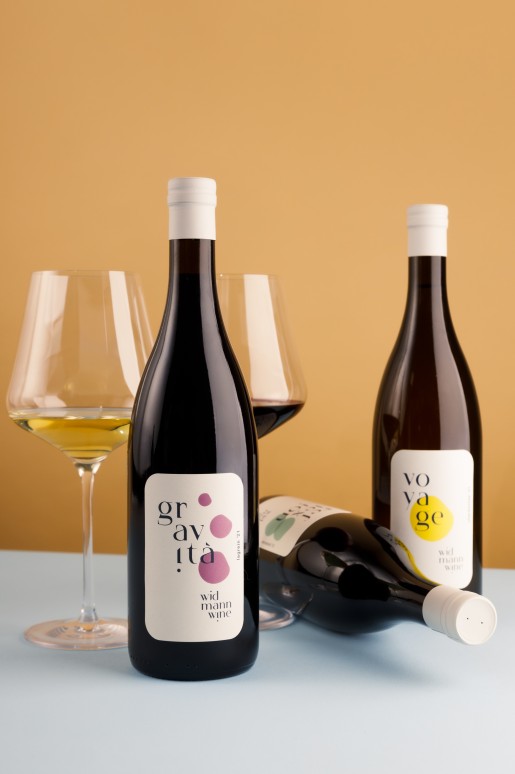
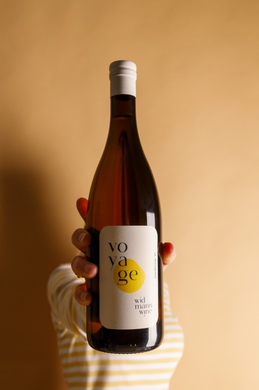
DISTINCTIVE IDENTITY
Your wine labels should clearly reflect your brand and values. They should be easily recognizable, especially if you have multiple wines and product lines. Visual elements such as logos, colors, symbols, shapes, and typography should create a cohesive identity that runs through your product range.
TARGETING YOUR AUDIENCE
What do you want your label to convey? Before embarking on a new wine label design, it's crucial to have a clear positioning for your brand. Without a well-defined target audience, all efforts may be in vain. Once you've identified your audience, it's time to develop a design that resonates with them. You know your audience, right? (when working with LU’s you will know!)
Targeting your audience applies to your entire corporate design. Whether targeting adventurers, traditionalists, or creative minds, tailor your label accordingly. #knowyouraudience
HIGHLIGHTING KEY INFORMATION
What are your customers looking for? Grape variety, region, or aging style? Understanding the unique selling points of your wines and knowing where your wines are sold is essential. Depending on your focus in winemaking, certain elements on your label may be more important. Whether customers seek specific regions, renowned vineyard sites, grape varieties, or aging methods, ensure these aspects are prominently displayed on your label.
STANDING OUT ON THE SHELF
Wow, a new label! It looks amazing up close, but have you positioned your bottle alongside others and viewed it from a distance of two meters? No? Well, it's time to do so. How does your label stand out on the shelf? Something may have a great impact up close but get lost in the crowd from a distance.
READABILITY AND AESTHETICS
Choose colors that align with your corporate design, but ensure they are easily distinguishable. Contrasting colors play a crucial role. Once again, take a step back and view the label from afar - there can be a world of difference.
TIMELESS DESIGN
Typography, illustration, color - the design possibilities are endless. That's why having a clear brand positioning is essential. By narrowing down your options and designing labels that align with your values, you'll create a timeless design that you'll still love in years to come and proudly stand behind.
The wine label is undeniably the heart of your winery, but it's not everything. There won't always be an opportunity to introduce your wine directly. That's why your core story and positioning are crucial. The best example? Your wines are featured in top restaurants' wine lists. Guests seek recommendations from the sommelier, and he/she recommends your wine. Why? Not just because you have a cool label, but because your story resonates and remains in the sommelier's mind (and of course, because your wine is exceptional!). By providing enough additional information to remember your story, you leave a lasting impression. And that's what truly matters. After all, guests only see the label once the bottle is on the table.

You can do it!
IT'S A LONG PROCESS, BUT GO AHEAD AND BE BRAVE!
Redesigning a wine label is a long process that you should not underestimate. Take your time and don't hesitate to seek assistance. After all, you don't want to do it all over again in three years. :)